

Colour Me Calm: Choosing Hues That Help Your Brain Work Better
Before you reach for a tin of paint, it's worth knowing this: your brain is making decisions about colour before you're even aware of it. The shades surrounding you right now are quietly shaping your mood, your energy levels, and your ability to think clearly. Let's talk about what the science says — and what you can actually do about it without spending a fortune.
How Your Brain Reads Colour
Colour perception begins in the eye but it doesn't stop there. Different wavelengths of light activate different neural pathways, triggering physiological and emotional responses that are deeply human — and surprisingly consistent across cultures. Warm colours (reds, oranges, deep yellows) stimulate the nervous system, raising heart rate and energy. Cool colours (blues, greens, soft greys) have the opposite effect, slowing the breath and inviting calm.
But here's the nuance that interior designers know and neuroscientists are increasingly confirming: it's not just the hue that matters. Saturation and value — how vivid or muted, how light or dark — play an equally powerful role. A saturated, bright red is stimulating almost to the point of agitation. A dusty terracotta? Grounding and warm without the overwhelm.
Brain insight! Studies in environmental psychology show that blue and green environments support sustained attention and creative thinking, while warmer tones are better suited to short bursts of high-energy activity. Neither is universally 'better' — it depends entirely on the work you do.
Cool colours like blue and green slow the breath and invite calm.
A Note on Neurodiversity and Colour
Colour sensitivity is very real — and very individual. For many autistic people, highly saturated or contrasting colours can cause genuine sensory distress, making it harder to concentrate and easier to feel overwhelmed. For those with ADHD, the same vivid environment might be stimulating in a helpful way, or tipping into distraction.
There is no one-size-fits-all answer here. What matters most is paying attention to your own nervous system — and that of anyone else sharing the space. If a colour makes you feel slightly edgy or tired without obvious reason, trust that feeling. Your body is giving you data.
Choosing Colour for Your Home Office
For Focus and Deep Work
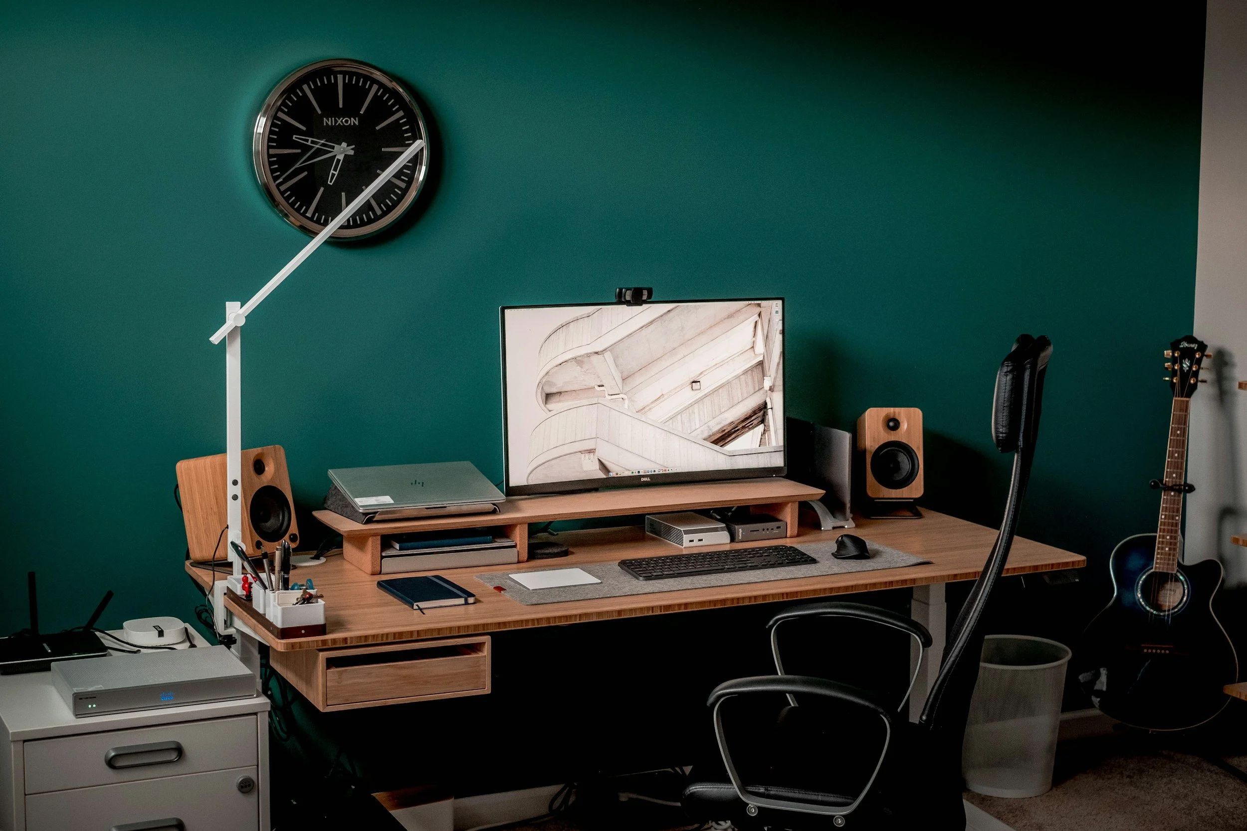
Soft blues and muted greens are your allies here. Think sage, duck egg, slate blue, or chalky teal. These tones reduce cortisol and support the kind of sustained, deep focus that writing, analysis, and problem-solving demand. They also happen to sit beautifully alongside natural materials and wood tones — a bonus for those who love a biophilic workspace.
For Creativity and Energy
Warm, muted tones — terracotta, warm sand, dusty blush, soft ochre — bring energy without the aggression of full-on red. They lift mood, encourage lateral thinking, and feel genuinely welcoming. If you do creative or client-facing work, these tones create a warmth that comes across on video calls too.
For Calm and Nervous System Support
Soft neutrals with warm undertones — linen, stone, warm white, pale taupe — are the great steadiers. They reduce visual noise and give an overstimulated brain somewhere to rest. Particularly worth considering if you experience anxiety, burnout, or sensory overload.
When You Can't Paint the Walls
You don't need to commit to a full room repaint to experience the benefits of colour. A large piece of wall art, a richly coloured throw, a new desk lamp shade, a set of stationery in a considered palette, or even a colourful plant pot can shift the feeling of a space significantly. Colour works through accumulation and repetition — small, intentional additions add up.
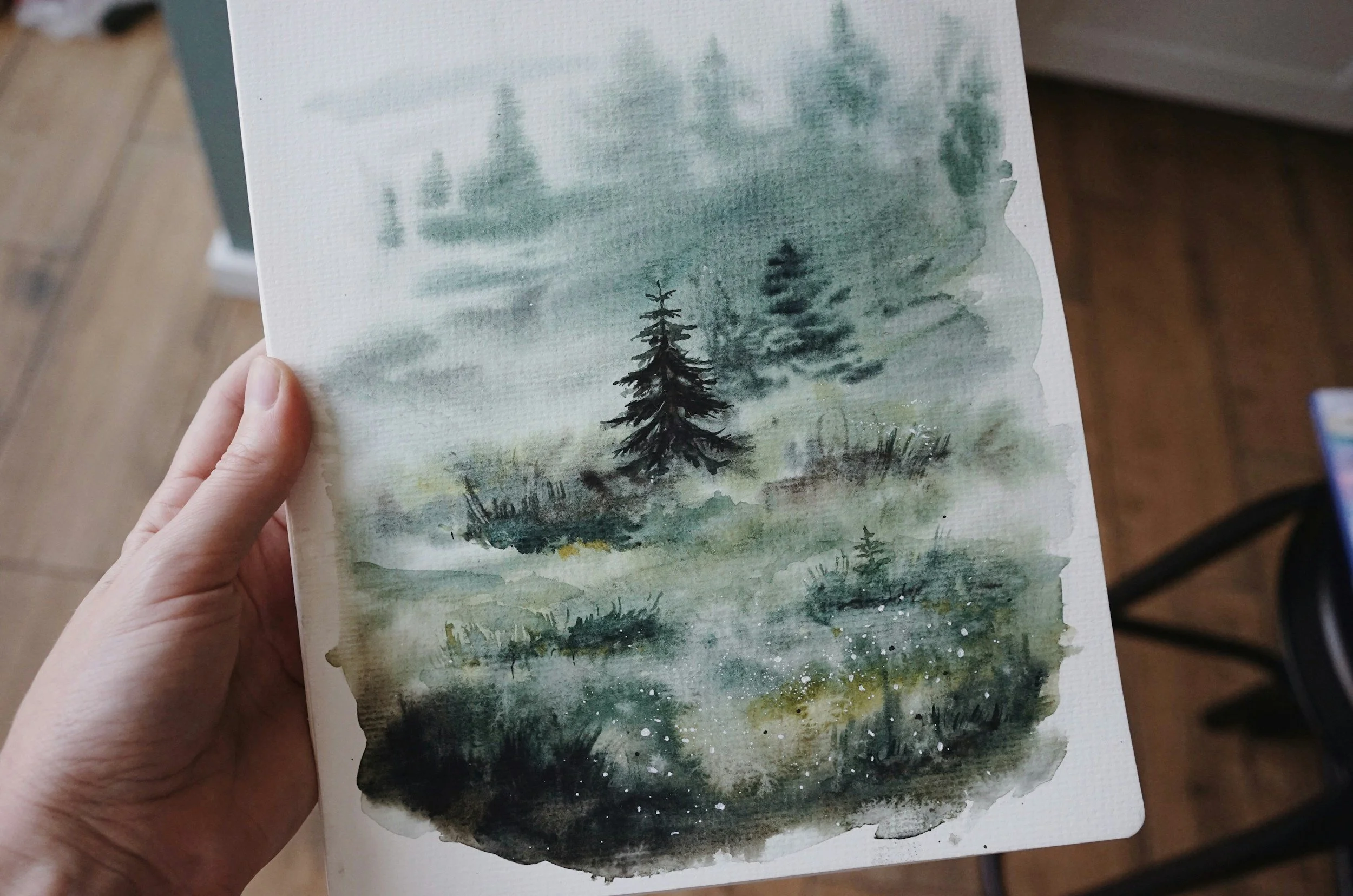
A soothing piece of art can truly help you experience the benefits of colour.
Colour Quick-Reference
Deep focus & clarity: Sage green, dusty teal, soft slate blue
Creativity & warmth: Terracotta, warm ochre, dusty blush, burnt sienna
Calm & nervous system support: Warm white, linen, pale stone, soft taupe
Energy & motivation: Muted gold, warm amber — used as accents, not dominants
Avoid if sensory-sensitive: High-contrast combos, neon tones, very bright whites
Ultimately, the best colour for your home office is the one that makes you exhale when you walk in.
Start there, and layer thoughtfully from that feeling outward.
Until next week,
The WaW Studio
Helping you feel, work and live better — one small change at a time.
The best colour for your home office is the one that brings you joy when you walk in!